Client: Spark SF Public School
Uplifting equity
Completed at Arkis Emmi
Spark SF Public Schools supports, advocates for, and strengthens San Francisco’s public schools to ensure every student has access to an equitable, high-quality education. As a nonprofit that has raised funds to advance this mission for over a decade, the time had come to evolve the brand visually. The brief was clear: introduce fresh elements that bring energy and youthfulness, while retaining the recognisable spark asset and ensuring the brand continues to project a cohesive, professional presence.
Brand evolution, collateral, digital.
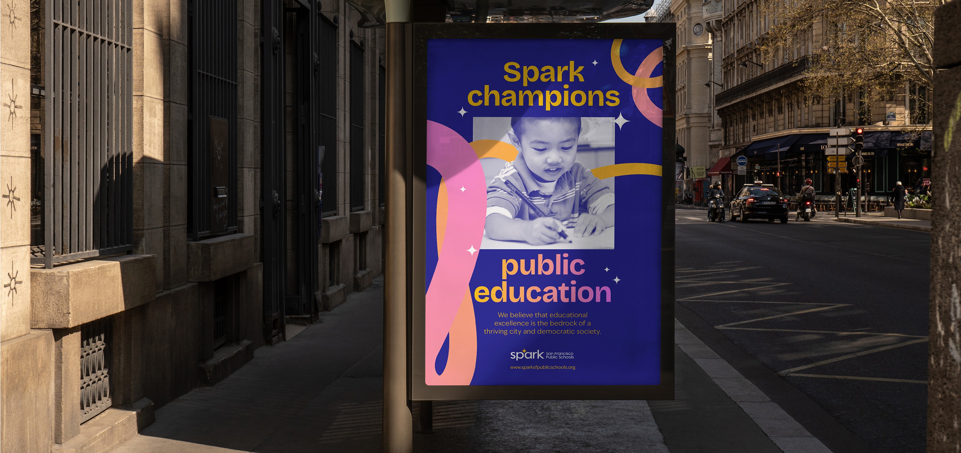


By repositioning the spark, it became the focal point of the logo. The typography was updated to a modern sans-serif, ensuring strong legibility across all channels.


Client: Spark SF Public School
Uplifting equity
Completed at Arkis Emmi
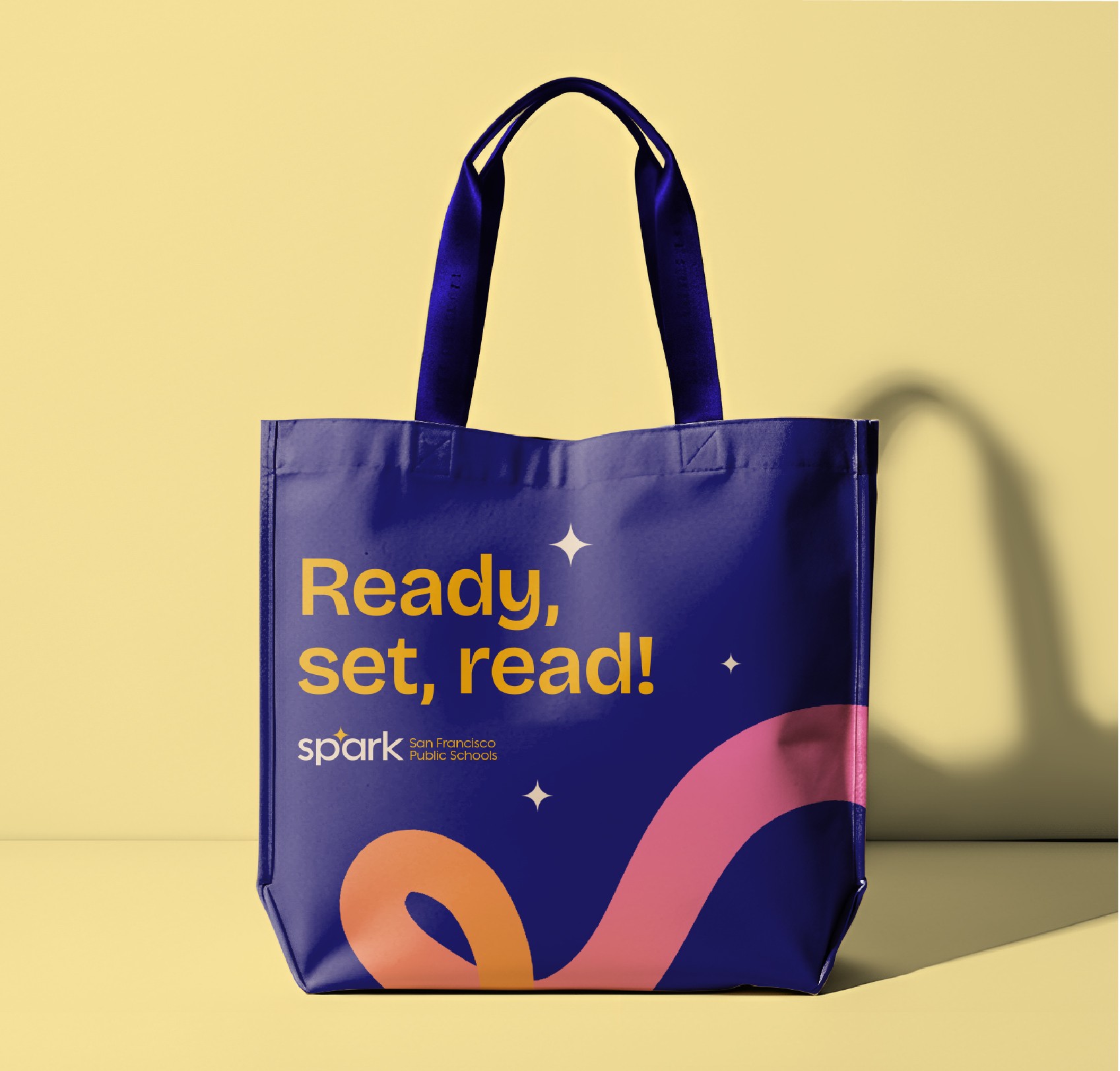
Spark SF Public Schools supports, advocates for, and strengthens San Francisco’s public schools to ensure every student has access to an equitable, high-quality education. As a nonprofit that has raised funds to advance this mission for over a decade, the time had come to evolve the brand visually. The brief was clear: introduce fresh elements that bring energy and youthfulness, while retaining the recognisable spark asset and ensuring the brand continues to project a cohesive, professional presence.
Brand evolution, collateral, digital.
By repositioning the spark, it became the focal point of the logo. The typography was updated to a modern sans-serif, ensuring strong legibility across all channels.
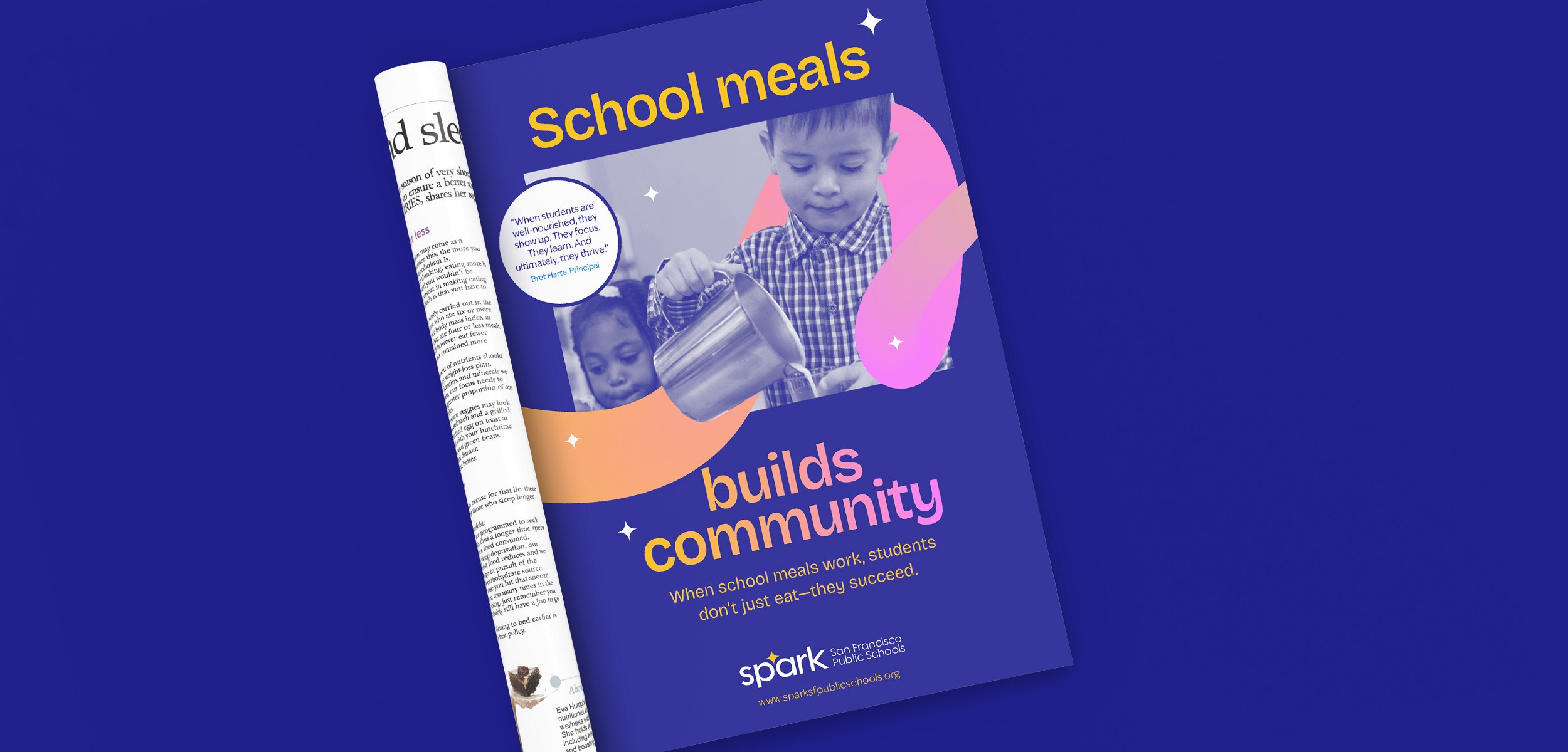
