Client: Saccas Fine Food
Keeping it fine
Completed at Arkis Emmi
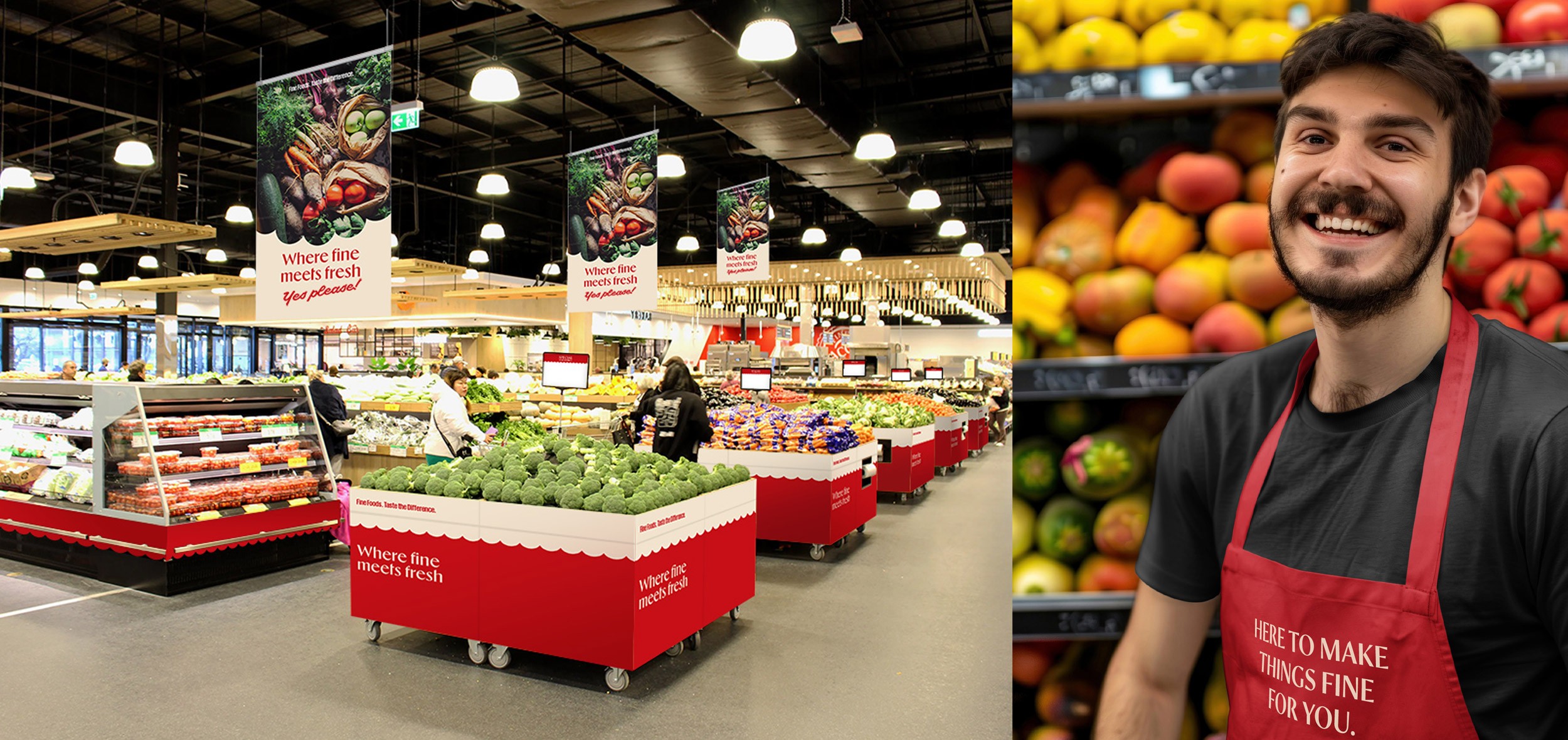
Sacca’s Fine Foods has been a trusted local name in fresh produce and quality ingredients. With multiple stores across Victoria and plans to expand nationally, the time was right to explore a brand refresh; one that could speak to a broader audience while staying true to its roots. The creative takes a stripped back approach, focussing on the stars of the show—fresh produce and quality ingredients—while still honouring the legacy of the existing brand.
Brand system, Packaging, Signage, Storytelling

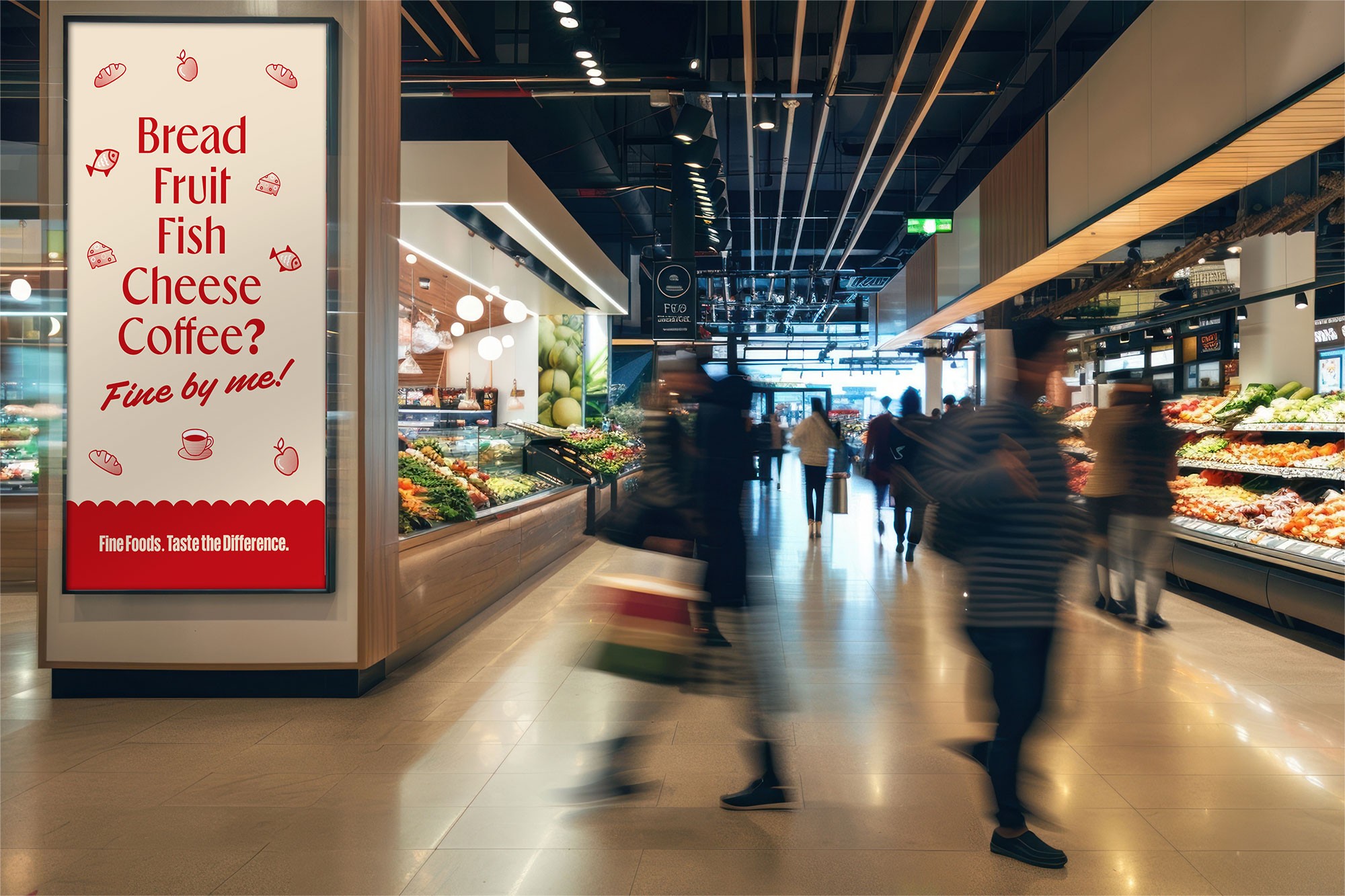
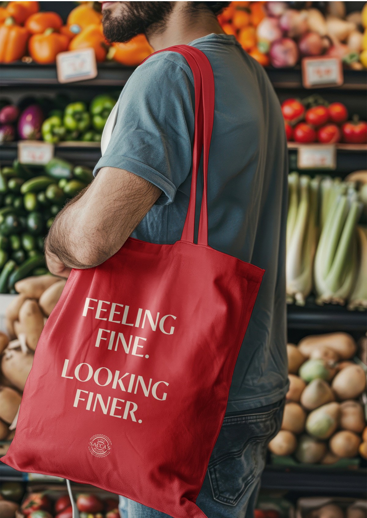
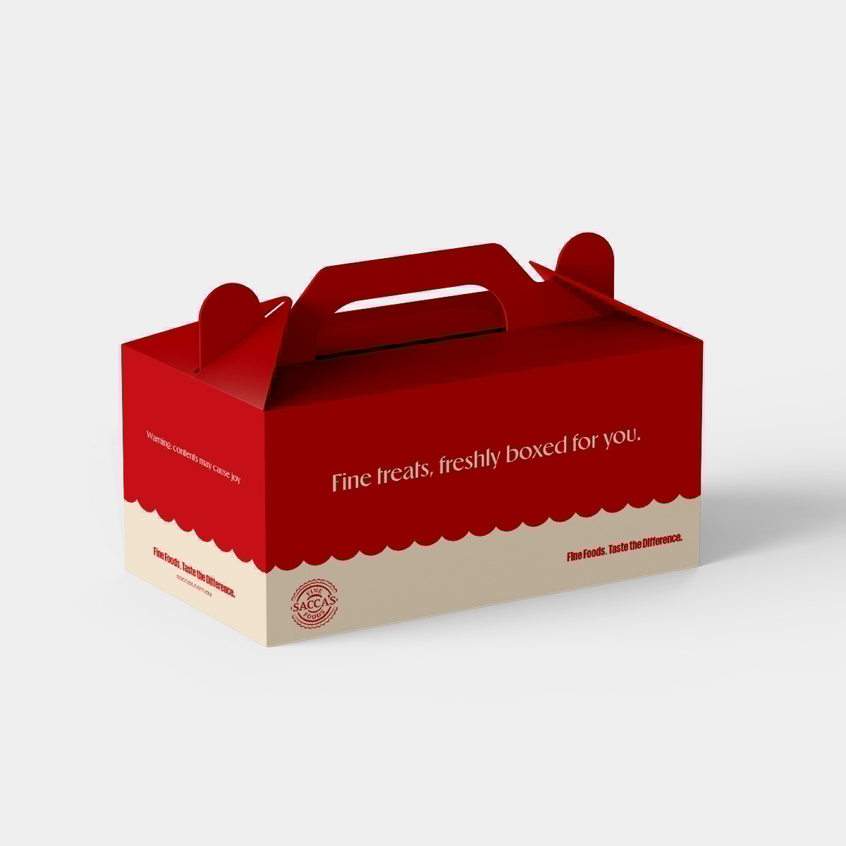
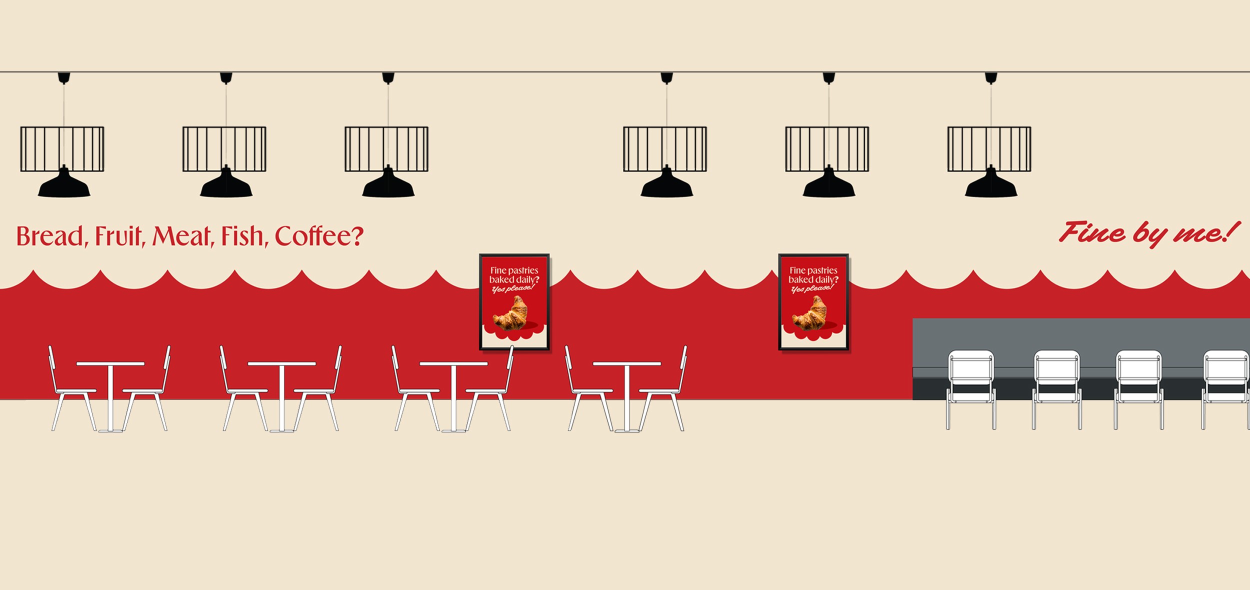
Building on the brand’s legacy, the familiar red was retained and paired with a new accent colour, modern fonts, and a new suite of icons. The scalloped detail from the original logo was reimagined as a distinctive visual device, adding a contemporary edge across brand touchpoints. To round it out, a cheeky, welcoming tone of voice is introduced, playing on ‘fine’ and is sprinkled throughout the customer journey.


Client: Saccas Fine Food
Keeping it fine
Completed at Arkis Emmi
Sacca’s Fine Foods has been a trusted local name in fresh produce and quality ingredients. With multiple stores across Victoria and plans to expand nationally, the time was right to explore a brand refresh; one that could speak to a broader audience while staying true to its roots. The creative takes a stripped back approach, focussing on the stars of the show—fresh produce and quality ingredients—while still honouring the legacy of the existing brand.
Brand system, Packaging, Signage, Storytelling
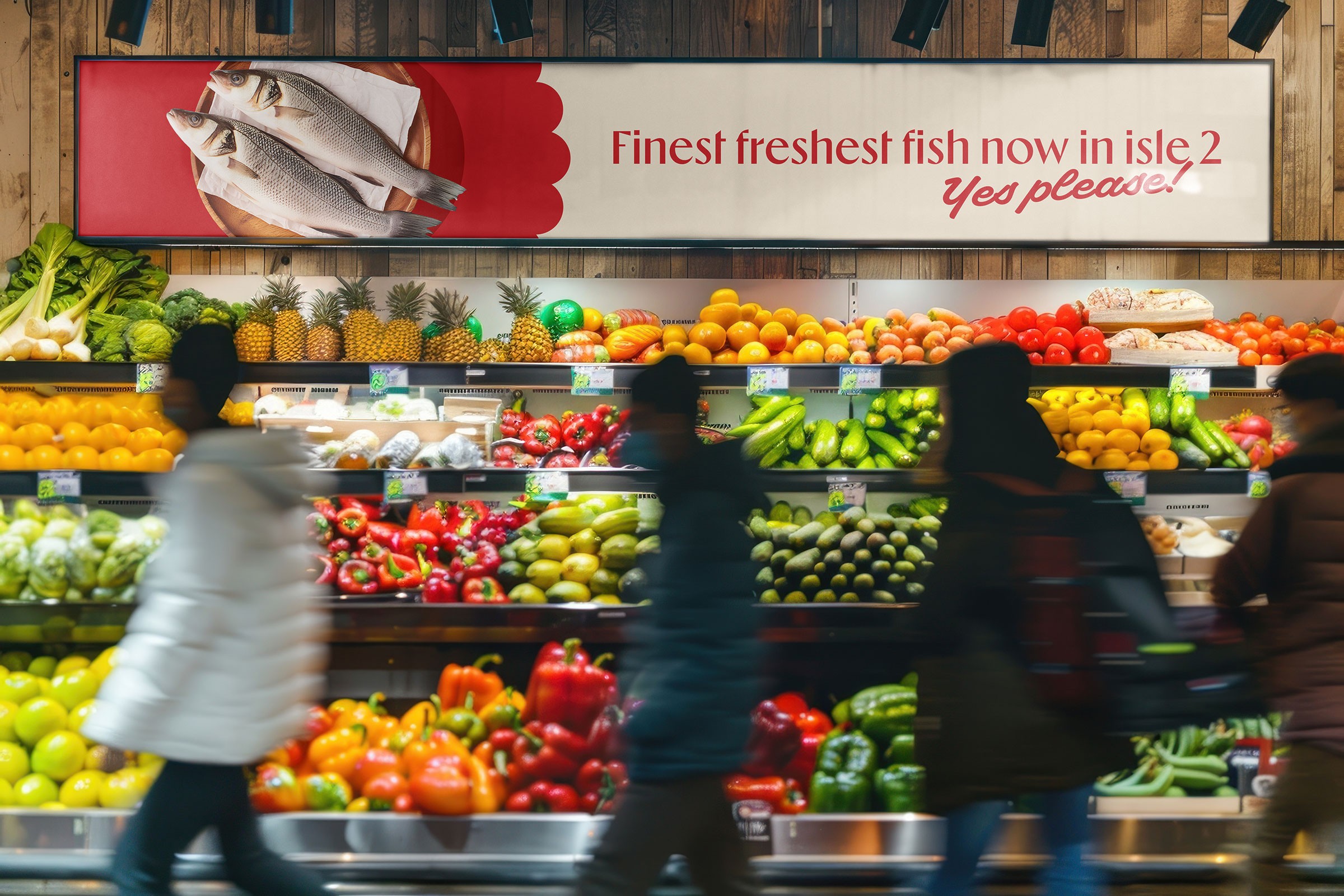


Building on the brand’s legacy, the familiar red was retained and paired with a new accent colour, modern fonts, and a new suite of icons. The scalloped detail from the original logo was reimagined as a distinctive visual device, adding a contemporary edge across brand touchpoints. To round it out, a cheeky, welcoming tone of voice is introduced, playing on ‘fine’, and is sprinkled throughout the customer journey.


Sacca’s Fine Foods has been a trusted local name in fresh produce and quality ingredients. With multiple stores across Victoria and plans to expand nationally, the time was right to explore a brand refresh; one that could speak to a broader audience while staying true to its roots. The creative takes a stripped back approach, focussing on the stars of the show—fresh produce and quality ingredients—while still honouring the legacy of the existing brand.
Brand system, Packaging, Signage, Storytelling, Digital
Building on the brand’s legacy, the familiar red was retained and paired with a new accent colour, modern fonts, and a new suite of icons. The scalloped detail from the original logo was reimagined as a distinctive visual device, adding a contemporary edge across brand touchpoints. To round it out, a cheeky, welcoming tone of voice is introduced, playing on ‘fine’, and is sprinkled throughout the customer journey.
