Client: Retail Food Group
Recognition matters
Completed at Bunch
Feeling valued fuels people to give their best—driving energy, loyalty, and trust. Recognition isn’t small; it sparks a ripple effect that builds performance and belonging. With this in mind, Retail Food Group set out to relaunch their recognition program with a new brand and identity that would capture attention while staying aligned to their corporate brand.
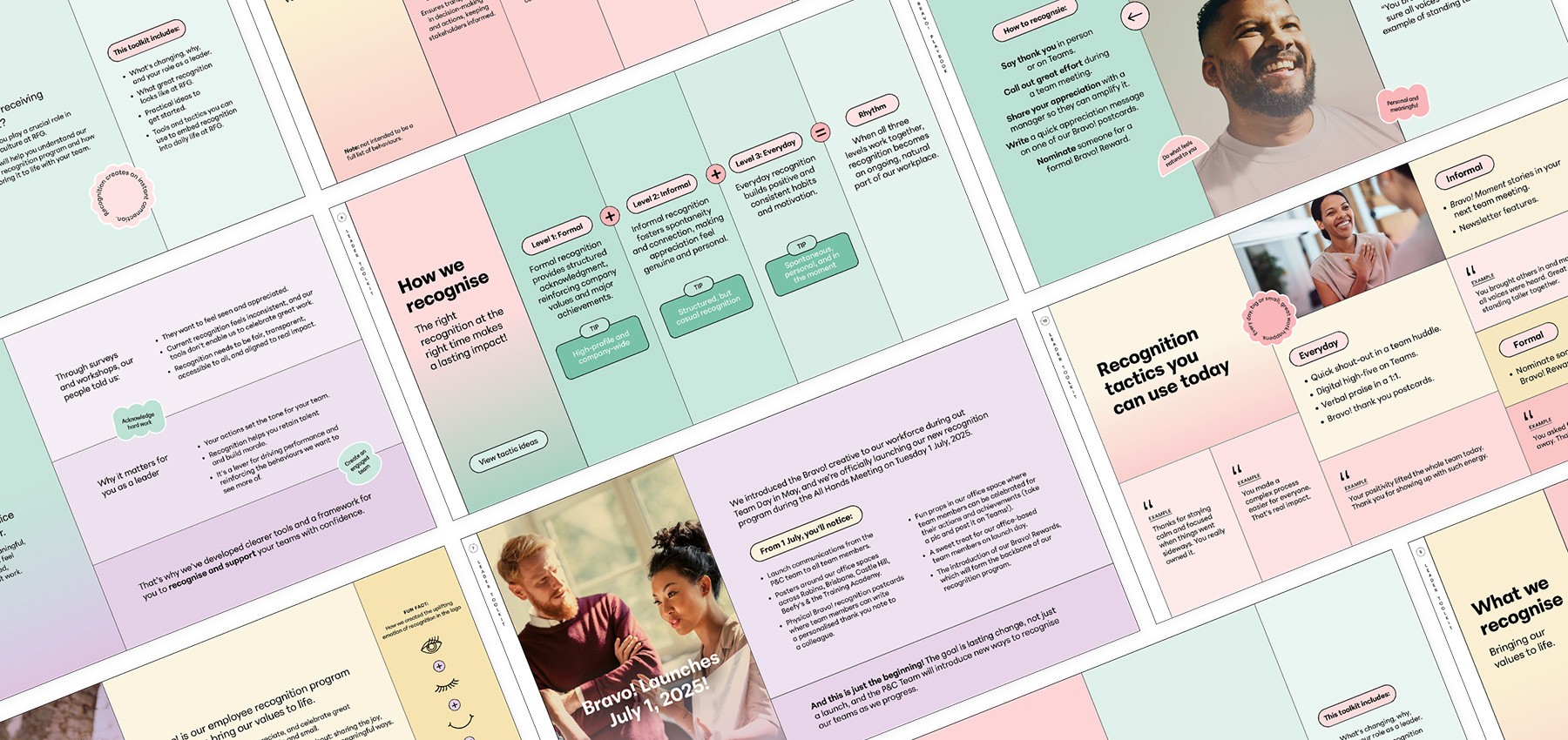
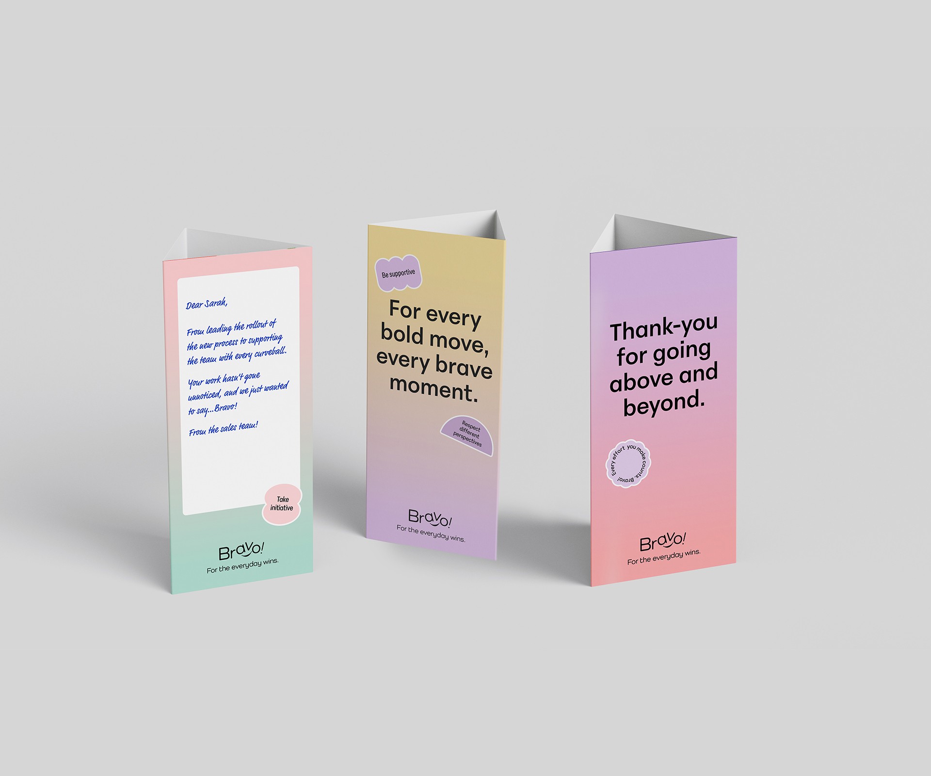
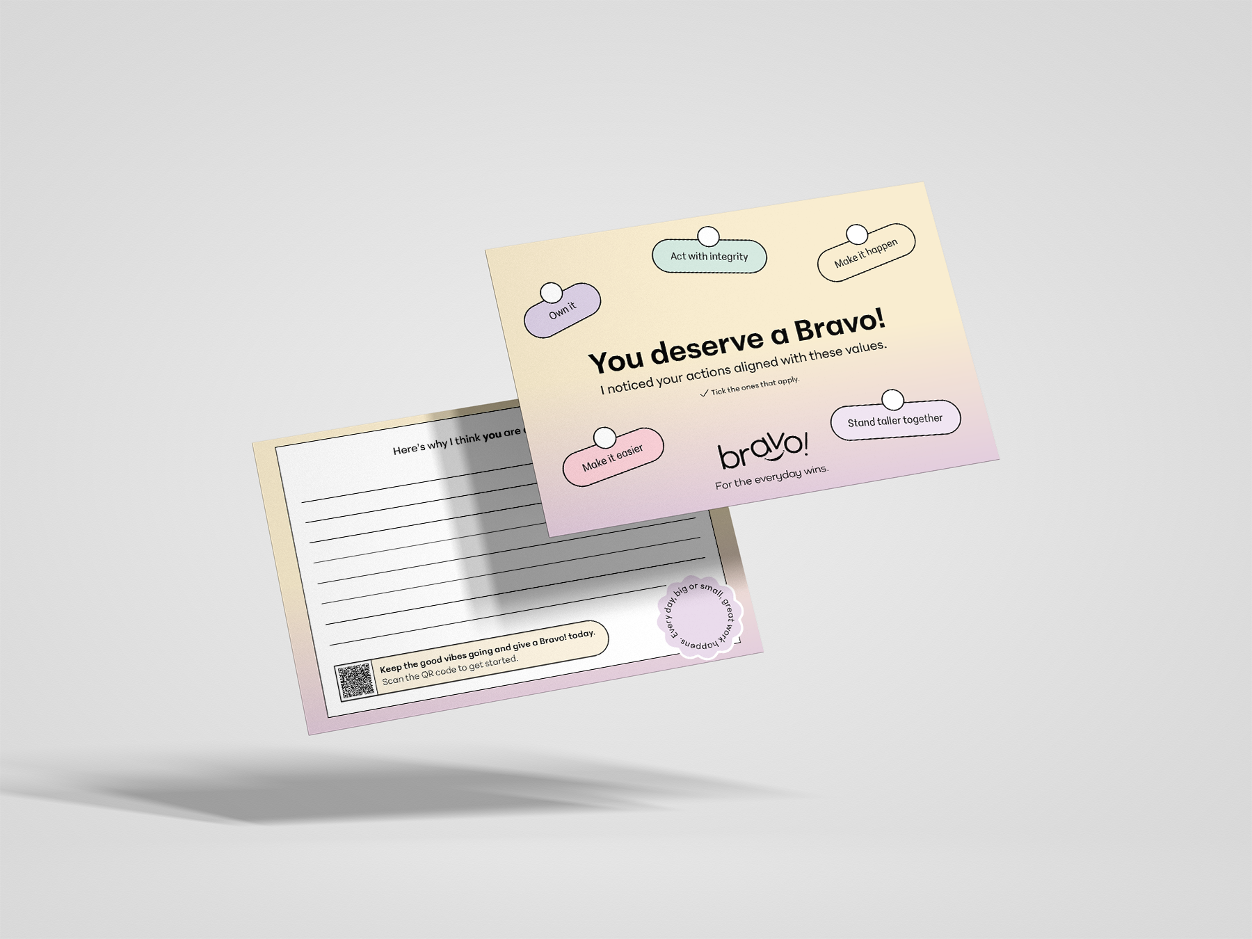
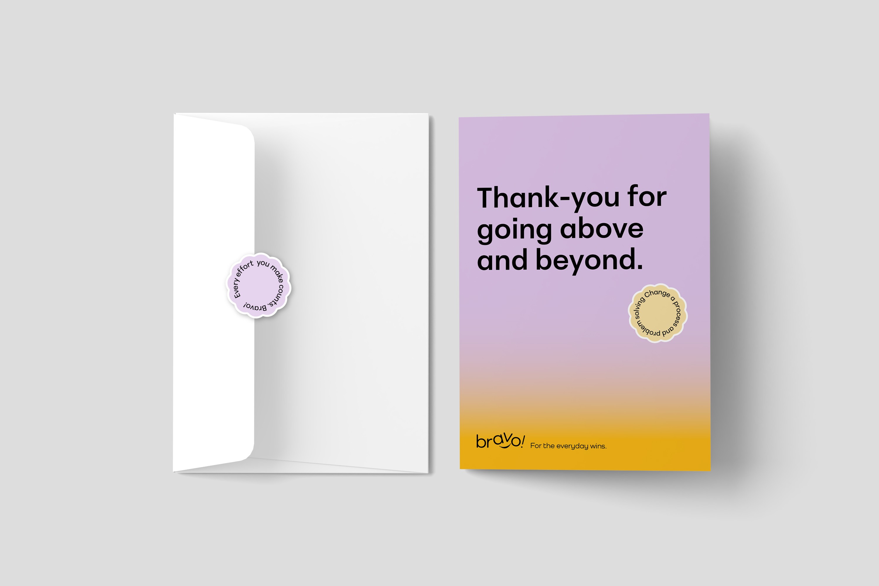
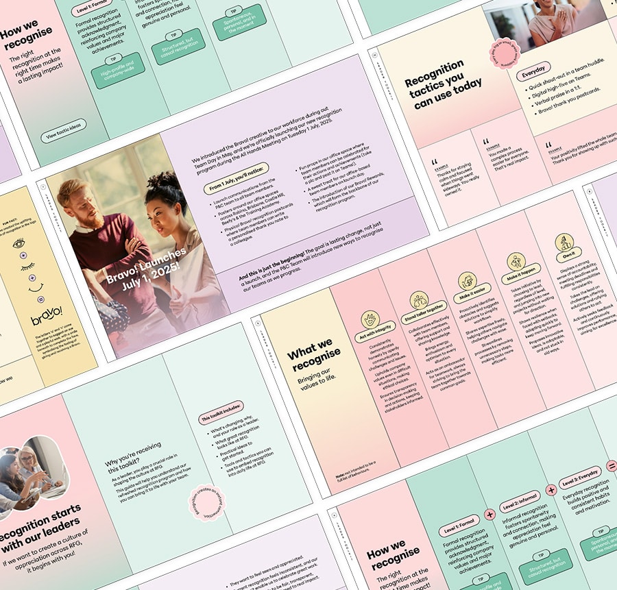
Naming, Brand identity, Asset roll-out, Leadership toolkit, Launch moment
The objective was to have a unique name for the program, make it memorable and meaningful for all employees. Bravo was selected as it is a spontaneous show of appreciation, a cheer for someone who’s done something great. The name captures what recognition is really about; sharing the joy, celebrating effort, and uplifting people in simple, meaningful ways.
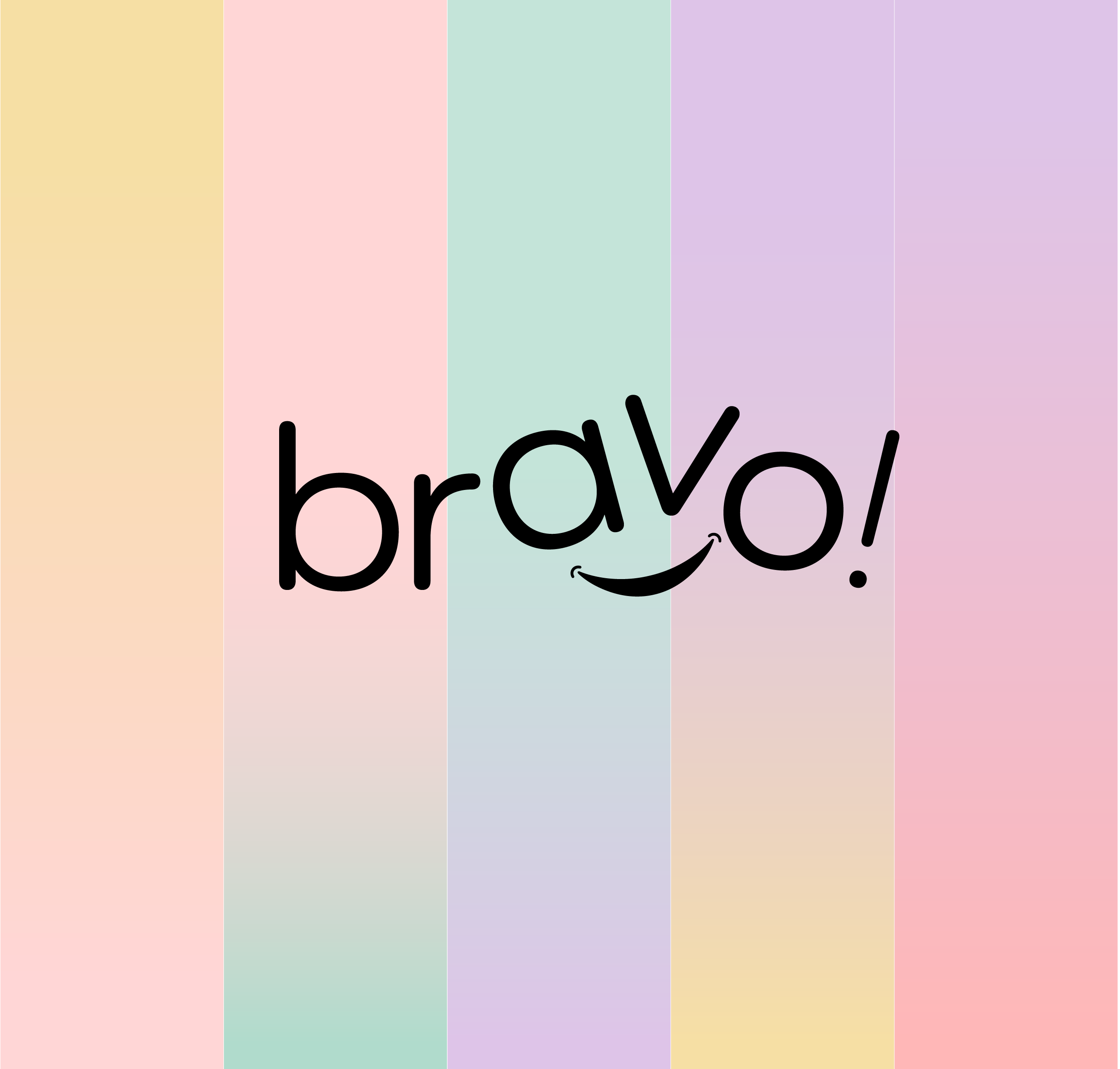
The palette draws from the corporate brand’s pastel tints, but replaces solid blocks of colour with gradients as its primary expression. The logo is inspired by the feeling of being recognised. The letters ‘a’ and ‘v’ subtly form an eye and a playful wink, while the smile below completes a friendly, expressive face.


Client: Retail Food Group
Recognition matters
Completed at Bunch
Feeling valued fuels people to give their best—driving energy, loyalty, and trust. Recognition isn’t small; it sparks a ripple effect that builds performance and belonging. With this in mind, Retail Food Group set out to relaunch their recognition program with a new brand and identity that would capture attention while staying aligned to their corporate brand.
Naming, Brand identity, Asset roll-out, Leadership toolkit, Launch moment


The objective was to have a unique name for the program, make it memorable and meaningful for all employees. Bravo was selected as it is a spontaneous show of appreciation, a cheer for someone who’s done something great. The name captures what recognition is really about; sharing the joy, celebrating effort, and uplifting people in simple, meaningful ways.


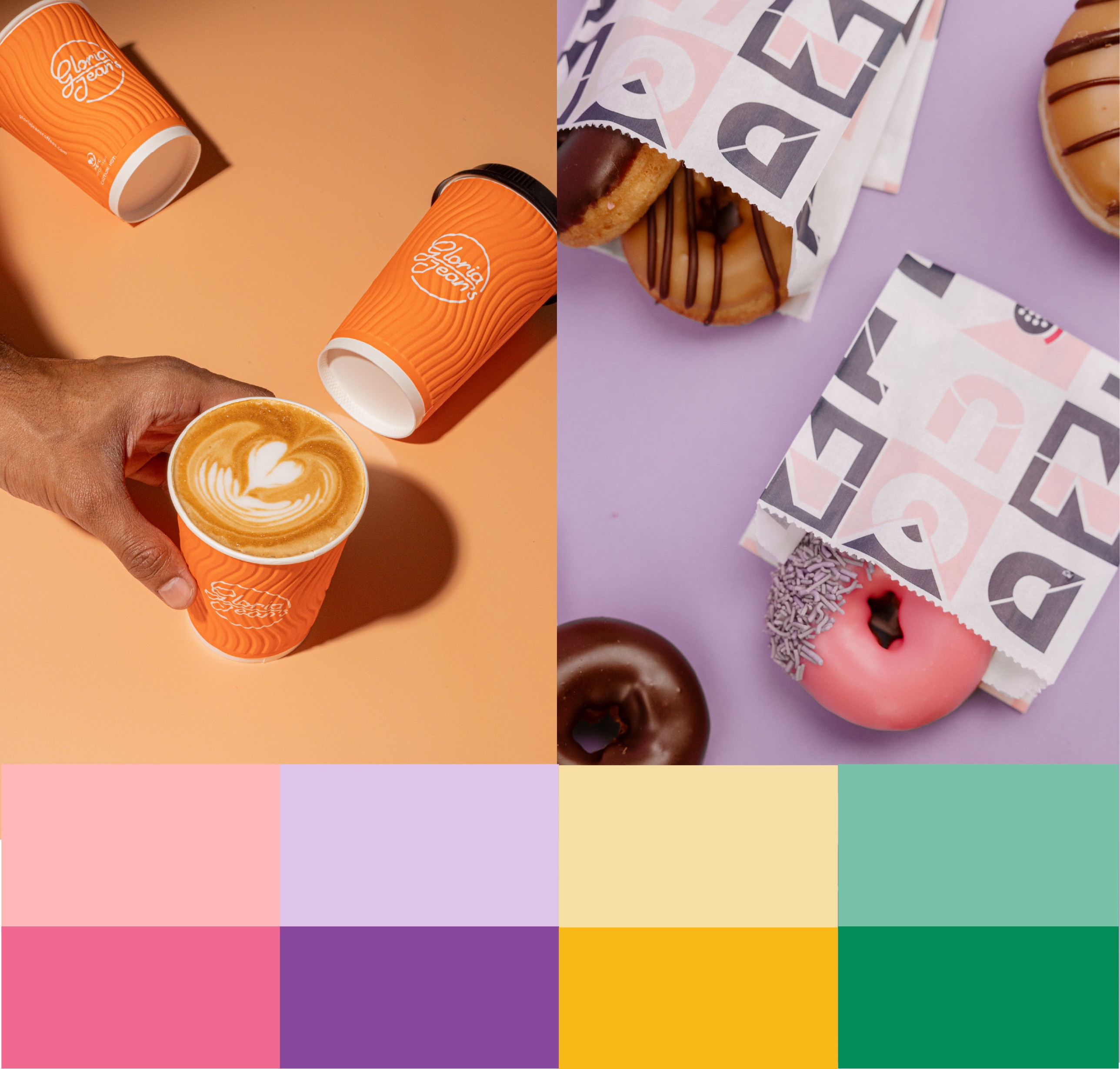
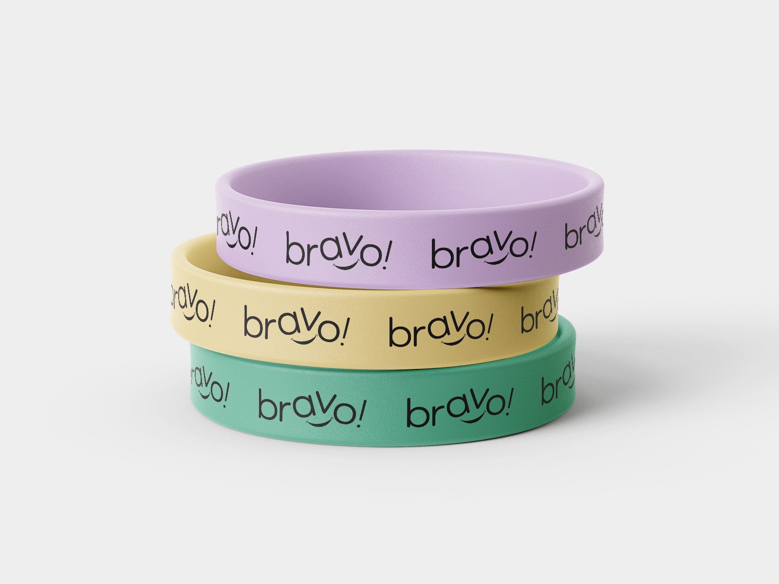
The palette draws from the corporate brand’s pastel tints, but replaces solid blocks of colour with gradients as its primary expression.
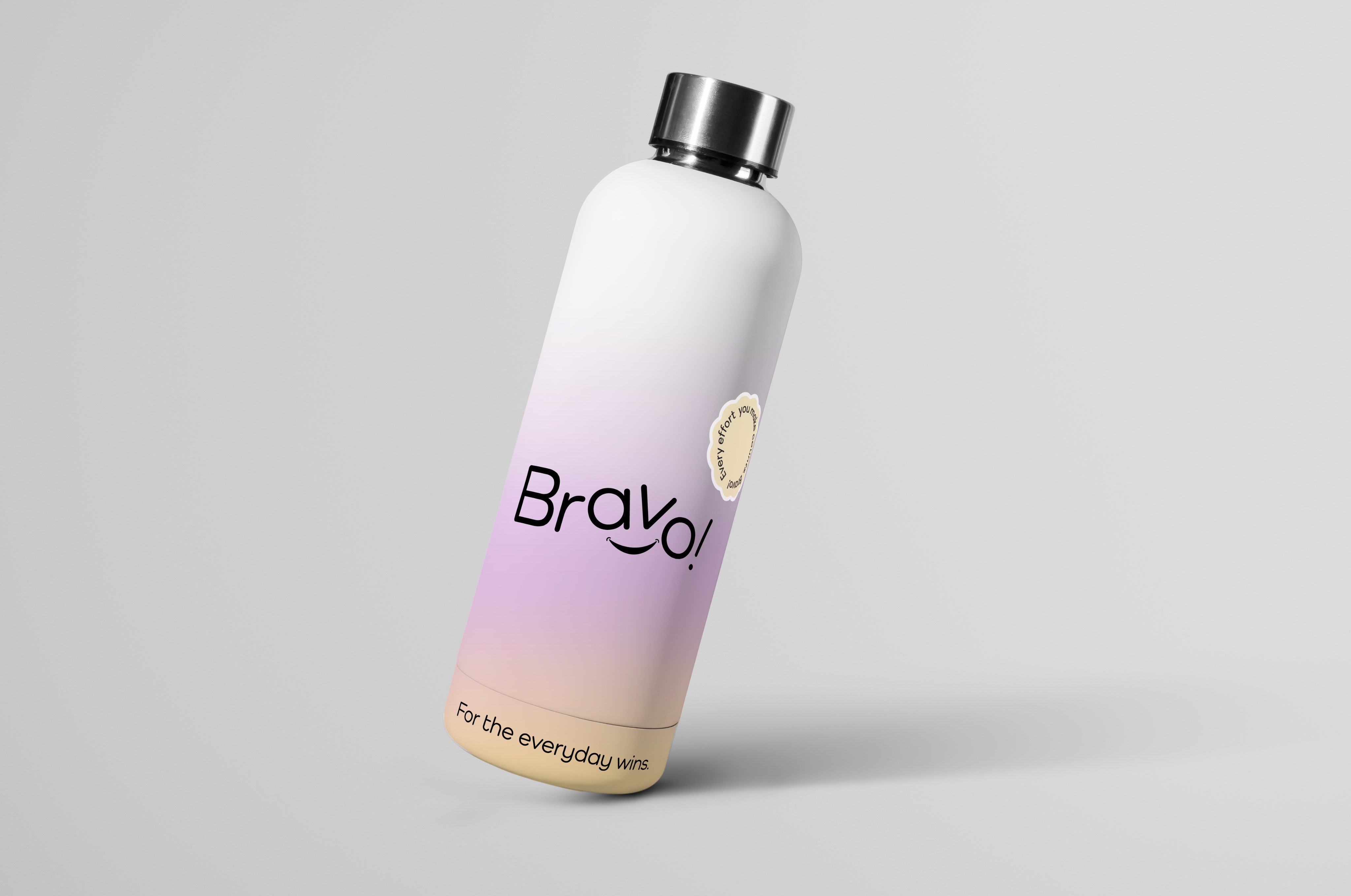
The logo is inspired by the feeling of being recognised. The letters ‘a’ and ‘v’ subtly form an eye and a playful wink, while the smile below completes a friendly, expressive face.


Feeling valued fuels people to give their best—driving energy, loyalty, and trust. Recognition isn’t small; it sparks a ripple effect that builds performance and belonging. With this in mind, Retail Food Group set out to relaunch their recognition program with a new brand and identity that would capture attention while staying aligned to their corporate brand.
Naming, Brand identity, Asset roll-out, Leadership toolkit, Launch moment


The objective was to have a unique name for the program, make it memorable and meaningful for all employees. Bravo was selected as it is a spontaneous show of appreciation, a cheer for someone who’s done something great. The name captures what recognition is really about; sharing the joy, celebrating effort, and uplifting people in simple, meaningful ways.


The Bravo palette draws from the corporate brand’s pastel tints, but replaces solid blocks of colour with gradients as its primary expression.
The brandmark is inspired by the uplifting feeling of being recognised. The letters ‘a’ and ‘v’ subtly form an eye and a playful wink, while the smile below completes a friendly, expressive face.
