Client: GMCU
Banking with purpose
Completed at Kinc Agency
GMCU is deeply rooted in the Goulburn Valley region of Victoria. For several years, the organisation had been experiencing stagnant member growth. With more people relocating from the city to regional Victoria, it was the right moment to reassess perceptions, refresh GMCU’s customer value proposition, and re-engage the community. To uncover rich insights, we conducted in-depth market research with members, non-members, and internal stakeholders to better understand brand recognition, product knowledge, and loyalty.
Strategic brand development, Narrative & tone of voice, Visual identity, Brand guidelines

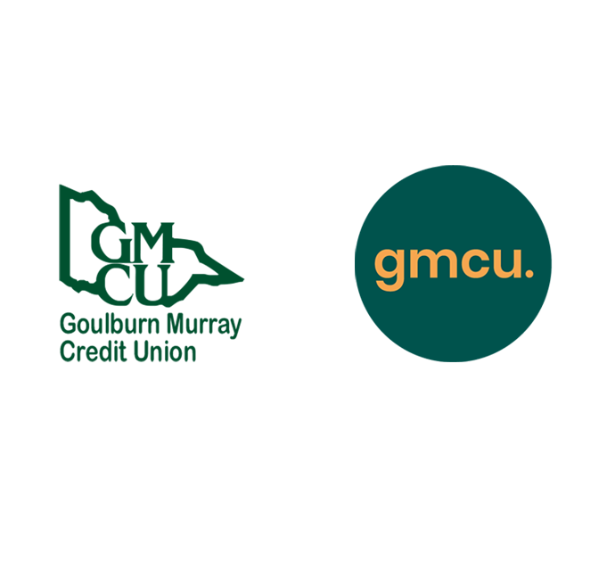
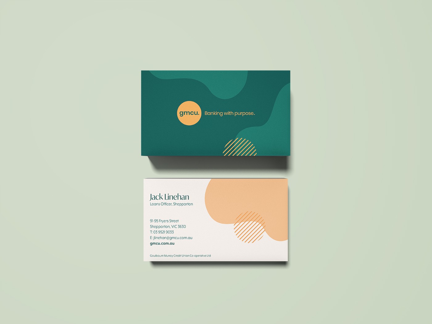
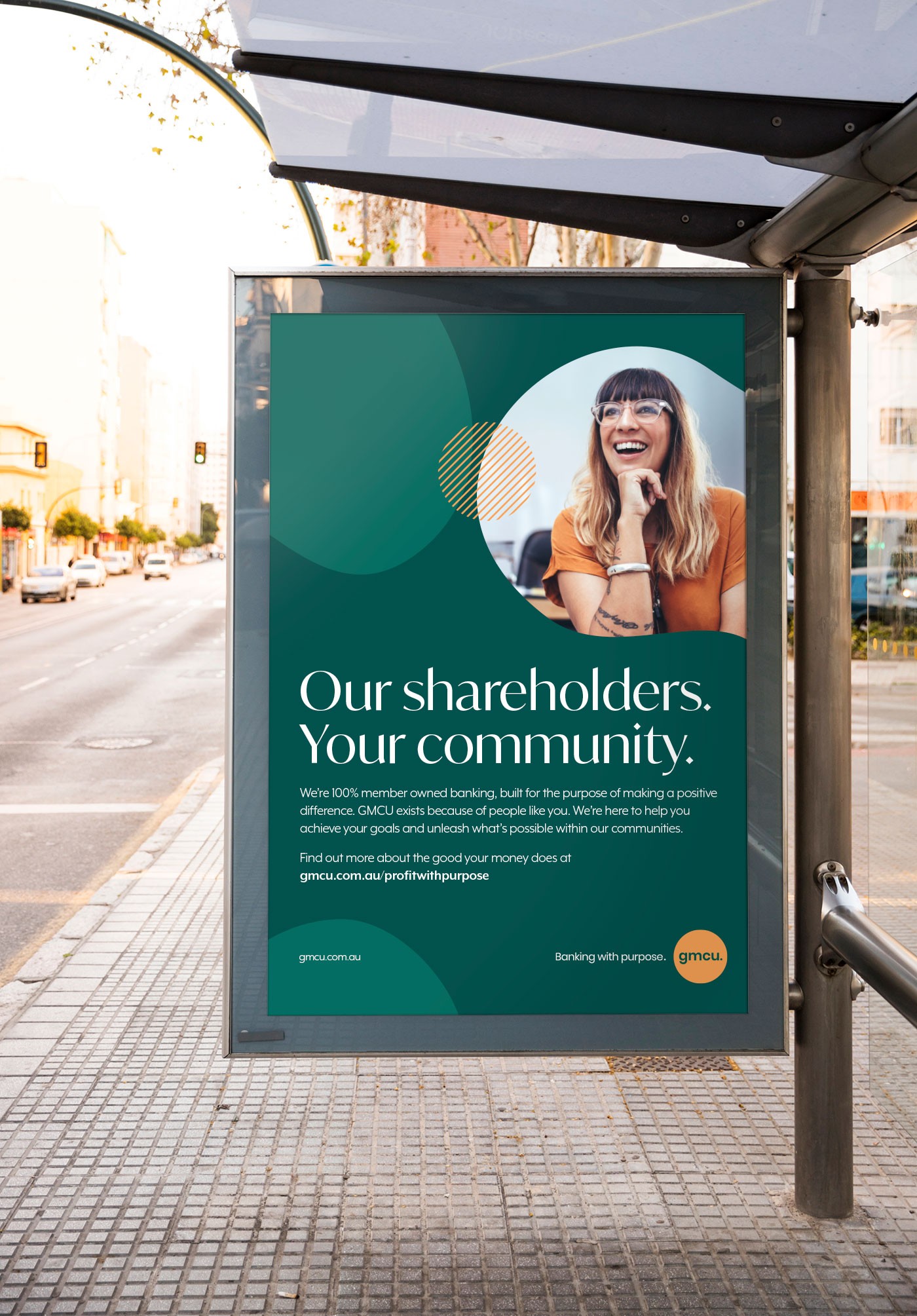
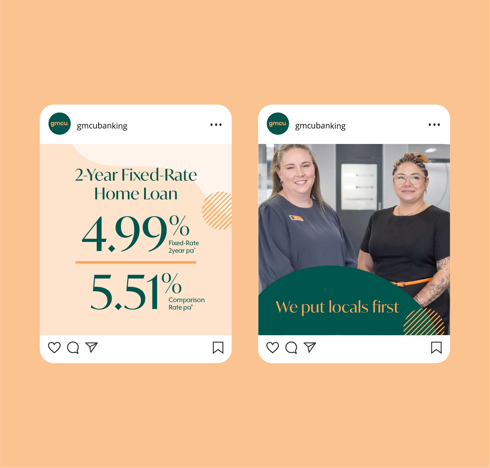
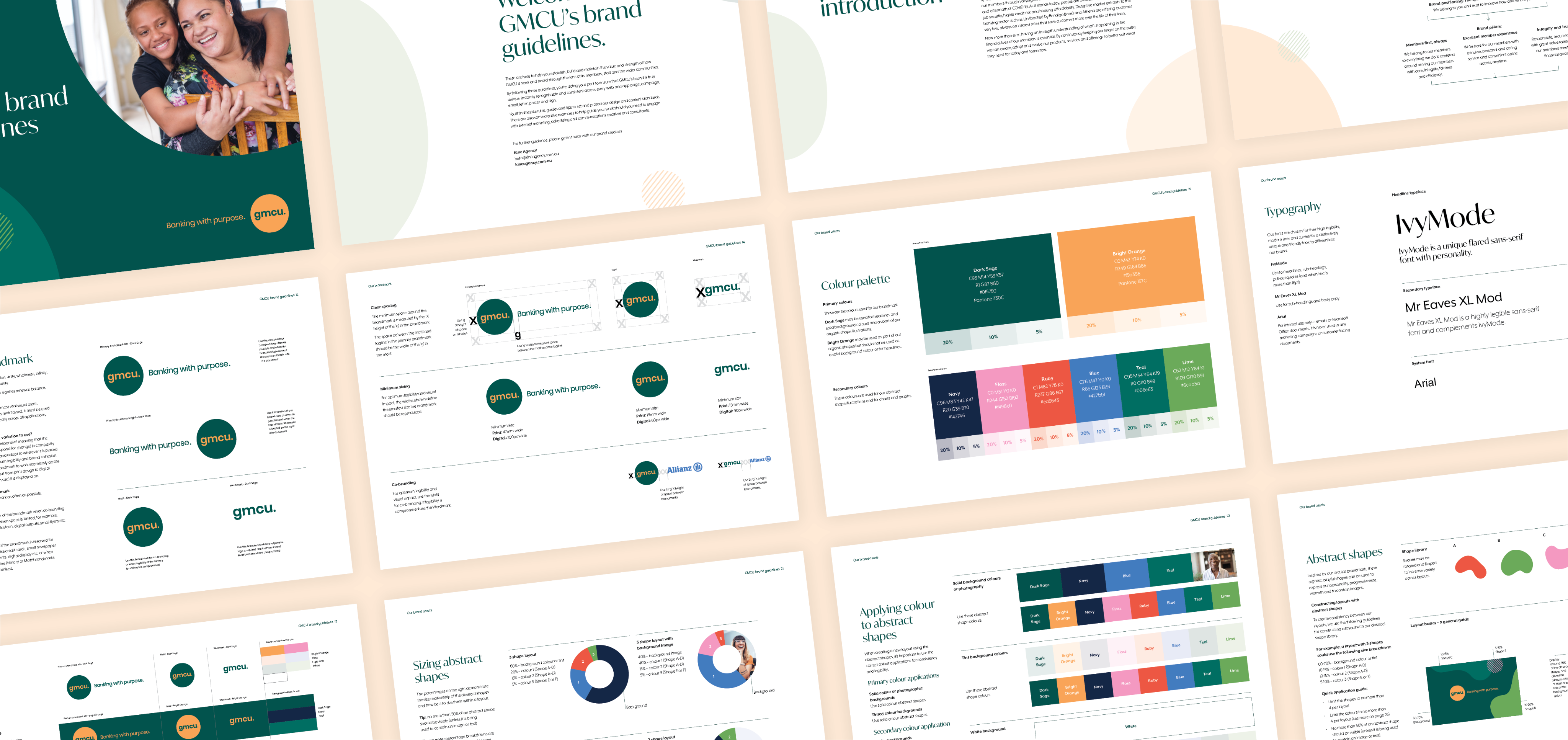
GMCU’s brand evolved from being perceived as old-fashioned and narrowly Victorian to a contemporary identity that still honours its signature forest green palette.


Client: GMCU
Banking with purpose
Completed at Kinc Agency
GMCU is deeply rooted in the Goulburn Valley region of Victoria. For several years, the organisation had been experiencing stagnant member growth. With more people relocating from the city to regional Victoria, it was the right moment to reassess perceptions, refresh GMCU’s customer value proposition, and re-engage the community. To uncover rich insights, we conducted in-depth market research with members, non-members, and internal stakeholders to better understand brand recognition, product knowledge, and loyalty.
Strategic brand development, Narrative & tone of voice, Visual identity, Brand guidelines


GMCU’s brand evolved from being perceived as old-fashioned and narrowly Victorian to a contemporary identity that still honours its signature forest green palette.


GMCU is deeply rooted in the Goulburn Valley region of Victoria. For several years, the bank had been experiencing stagnant member growth. With more people relocating from the city to regional Victoria, it was the right moment to reassess perceptions, refresh GMCU’s customer value proposition, and re-engage the community. To uncover rich insights, we conducted in-depth market research with members, non-members, and internal stakeholders to better understand brand recognition, product knowledge, and loyalty.
Strategic brand development, Narrative & tone of voice, Visual identity, Brand guidelines
GMCU’s brand evolved from being perceived as old-fashioned and narrowly Victorian to a contemporary identity that still honours its signature forest green palette.
